

Today on the JUFSEN BOOK CLUB, we’ll start a new series, based on …
Creative Illustration by Andrew Loomis, released 1947 by its publisher Titan Books, which is a phenomenal book for any artist wanting to make headway for understanding all the nooks and crannies within the craft of not just illustration, but in general, the arts as a whole.
All credit goes to the rightful owner and author of the book, Andrew Loomis and its publisher Titan Books. This is a summation and interpretation in own words.
Part One of the book which discusses the concept of Line, has been divided into FOUR SECTIONS just to make it a little simpler for you!
Section 1 ✿ Seven Primary Functions of Line – p.25
Section 2 ✿ Line and Symbols – p.25 to p.33
Section 3 ✿ Line as Division – p.34 to p.39
꧁ Section 4 ✿ Perspective and Catching Attention – p.40 to p.53 ꧂
Section 5 ✿ Rendering Line – p.54 to p.79
Section 3 was all about making the blank piece of paper an attracting composition, with the help of what Loomis calls, Formal and Informal Subdivision, just two high-sounding phrases that roughly mean drawing lines that divide your canvas or paper into equal or then unequal spaces. This Section, S4, is all about composition too! This time however, your division will follow one, two, three or even four points, we’ll call Vanishing Points.
This is using line as a guide to make perspective!
And to top of it off with a cherry, you’ll get some tips and tricks for getting the attention brought to your picture.
It’s good to start with saying that, a helping hand in getting these concepts to stick, is to first get a grip on perspective, and all the principles it has for you to learn and understand. An amazing course you can consider taking is the Perspective Drawing Series by Marshall Vandruff, but you can also check out the JUFSEN RECOMMENDATIONS on perspective!
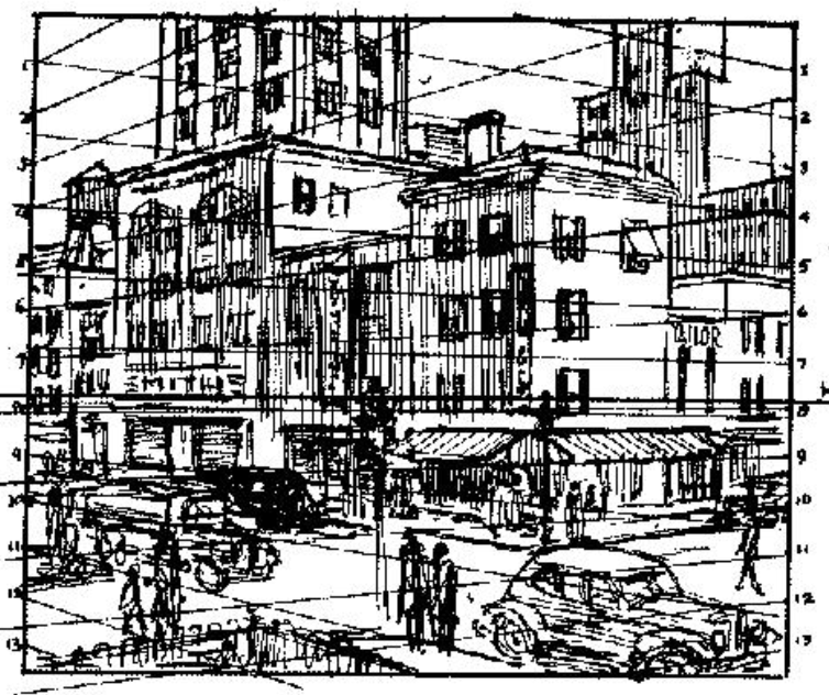
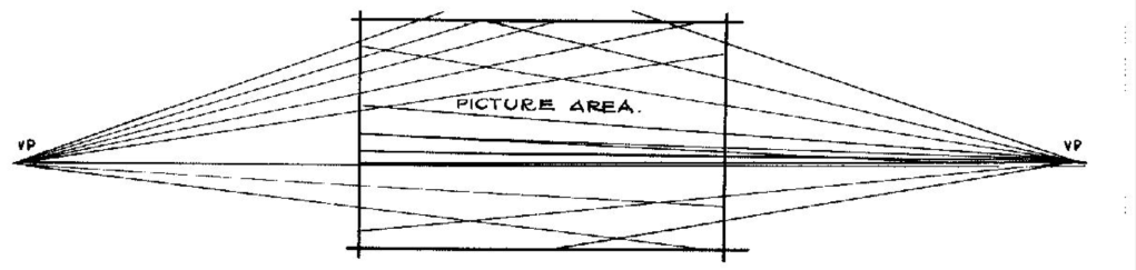
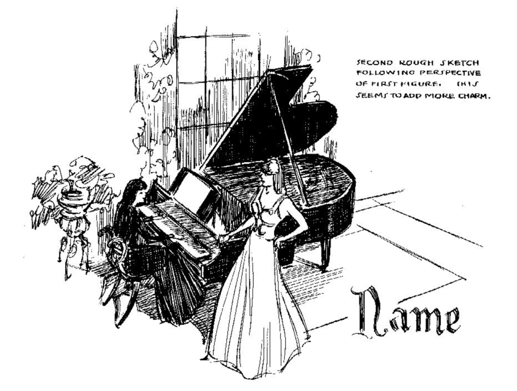
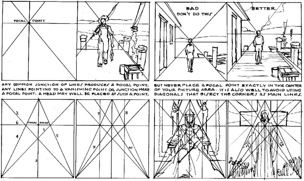
With that out of the way, the first picture in the slideshow displays what is called two points perspective, referring to the amount of Vanishing Points that’s being used, in this case, it’s two. And in this illustration, Loomis shows us that a fast and effective way of composition can be to equally mark off spaces on the shape’s contours, then following the Vanishing Points that are outside the picture’s boundaries. Then have your fun adding in figures and houses!
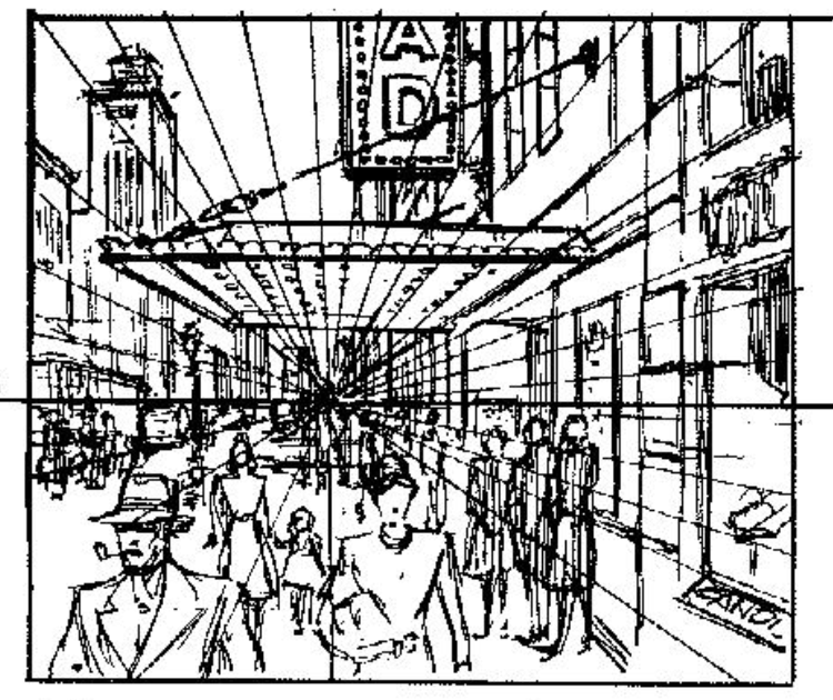
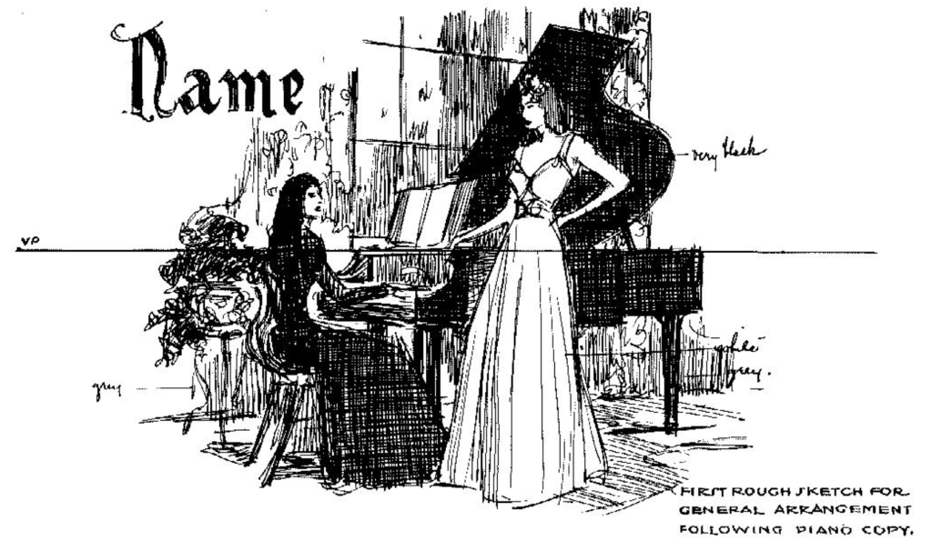
The next picture, shows one point perspective, meaning one Vanishing Point. This composition is done by choosing a point wherever you want on the horizon, then drawing straight lines radiating from it.
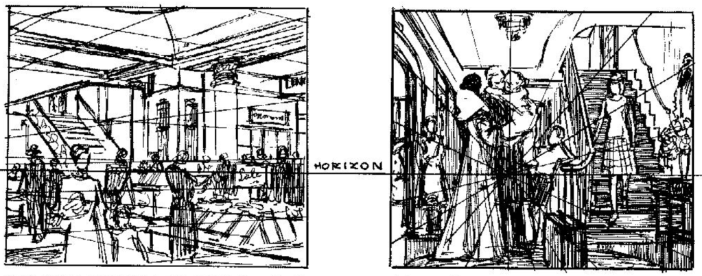
The principles of perspective of course, also apply to interiors! Both one point, and two point!
Remember that the perspective lines only serve as a guide, a way of planning your composition. Follow them but have some freedom!
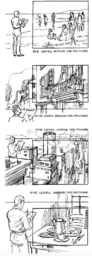
As was said in Fun With A Pencil, Part Three, S1, the horizon is the eye-level. To make a composition using perspective as your guide, it’s plenty helpful to know your eye level and your viewpoint. Eye level meaning where your eye is, and viewpoint is where you are stationed, the spot of where the camera or the person looking, are standing, high or low from the horizon.
The basic principle of perspective is that if something is above the horizon, the guiding lines of perspective must slant downward to the Vanishing Point, and if something is set below on the horizon line, on the ground you could say, the lines must slant up to the VP’s. Loomis suggest then, that our viewpoint, decides our horizon.
Now if you haven’t got a hang of the terms of perspective, Loomis, JUFSEN and most artist would recommend you as a beginner or even advanced artist to get the fundamentals of perspective set and clear for you. It not only helps in understanding the terms written above, but can make a huge and beneficial change in the compositions you make as an artist, for everything you draw, either in nature or from imagination must follow the rules of perspective, if the look of 3d is what you want. (Read more at, Perspective Comes First in Art)
Understanding perspective, let’s you approach the same subject in more charming and interesting ways, than you’d would without it.
Certain angles in perspective give off a certain emotion, a certain feeling to it, so getting a grip on perspective lends you even more room for experimentation. Looking from down below, up at the figure, for example, below gives the psychology of grandeur, of something greater than life. Like you are looking up at an at actress or actor on stage.
Looking from up below, down at the figure can give a more beautiful appearance to it, like we are looking down at mountain, or from a hill, getting a look on all that is seen below.
An ordinary image can be elevated when giving thought to the eye level, changing the feeling of it.
Loomis suggest to get a stepladder, or even lie on the floor while sketching from life, it might lend an completely different feeling, which you might be looking for.
All of this, boiled down, is a way of attracting more attention to your illustration, painting or drawing. It’s wonderful what simple line can do!
Here’s come a whole tray of attention-seeking devices you can use in your compositions as an artist.
Here’s both a way of using more Formal but also Informal ways of attracting attention your focal point. It’s a matter of experimenting and finding a way to fit your interpretation of your subject, expressing it, the way you’d like!
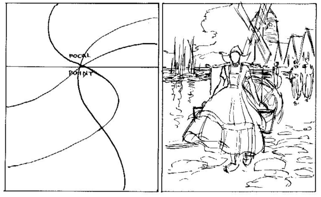
Every picture should in some way or another, include a main focal point, that is where your center of interest lies. And an axiom or quote that Loomis gives is that…
“All roads lead to Rome, is a fundamental in good composition. Your “roads” are lines”
Andrew Loomis
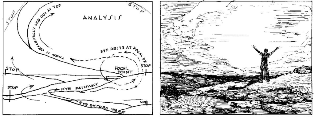
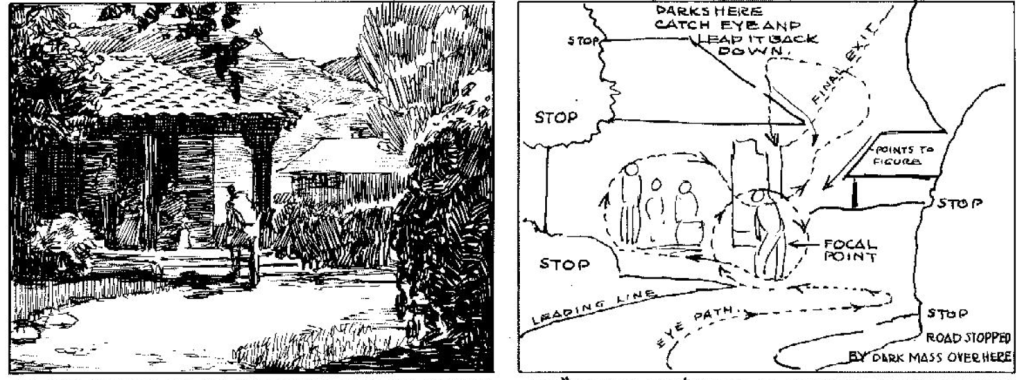
Here’s the axiom in practice. Choose your focal point and use the fifth Primary Function of Line, “To catch and direct the eye over a given course”. It’s a way of using line to plan the composition.
Loomis suggest that the eye should start at the bottom, never at sides, and to use “Stops” to lead the viewer on the path to the Focal Point more smoothly. You make an open way for the Focal Point, and stop it where it strays away.
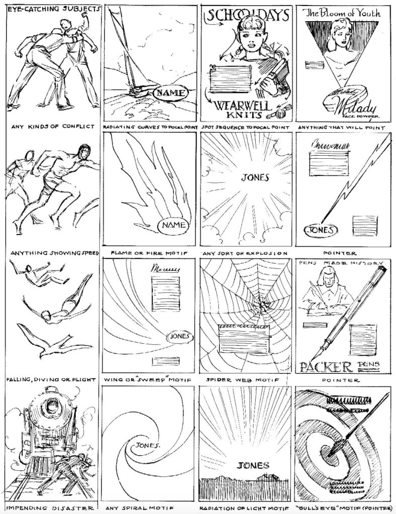
Subjects that lend attention, are often those which correspond to our nature as humans. Using the flight or fight mechanism for example. Choose a subject as universal as possible, something all can roughly relate to!
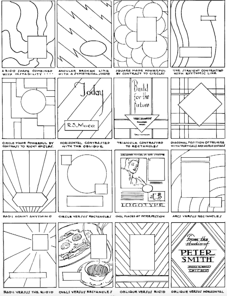
Shapes with their varying emotion connected to them, can also be useful to lend attention. This serves to give a more mechanical, modern or artificial look to the image. Use the contrasting of shapes and lines. As perspective shows you, decide where your Focal Point is and how you’ll guide the eye to it.
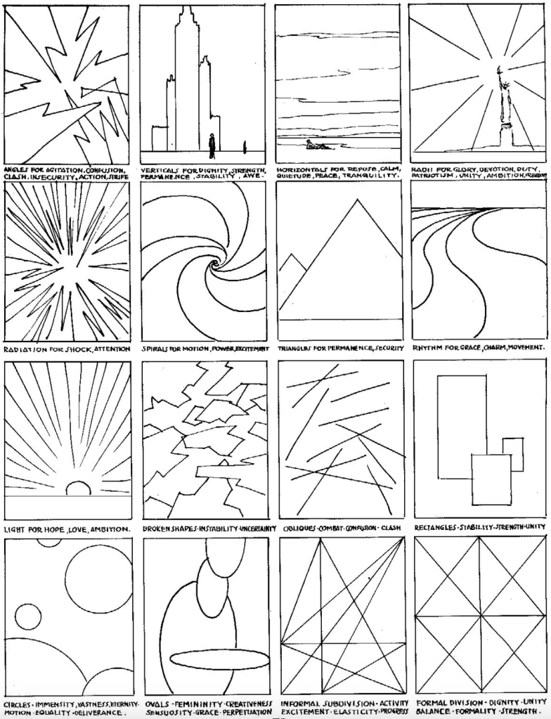
Line can also be used, as the first Primary Function of Line says, “To convey its own intrinsic beauty”. Or in other words, to give an emotional response.
Brent Eviston, in his book, The Art and Science of Drawing, which is also available as an online course on the website Skillshare, explains the concept of Line Expression or Line Emotion amazingly! Do consider checking it out!
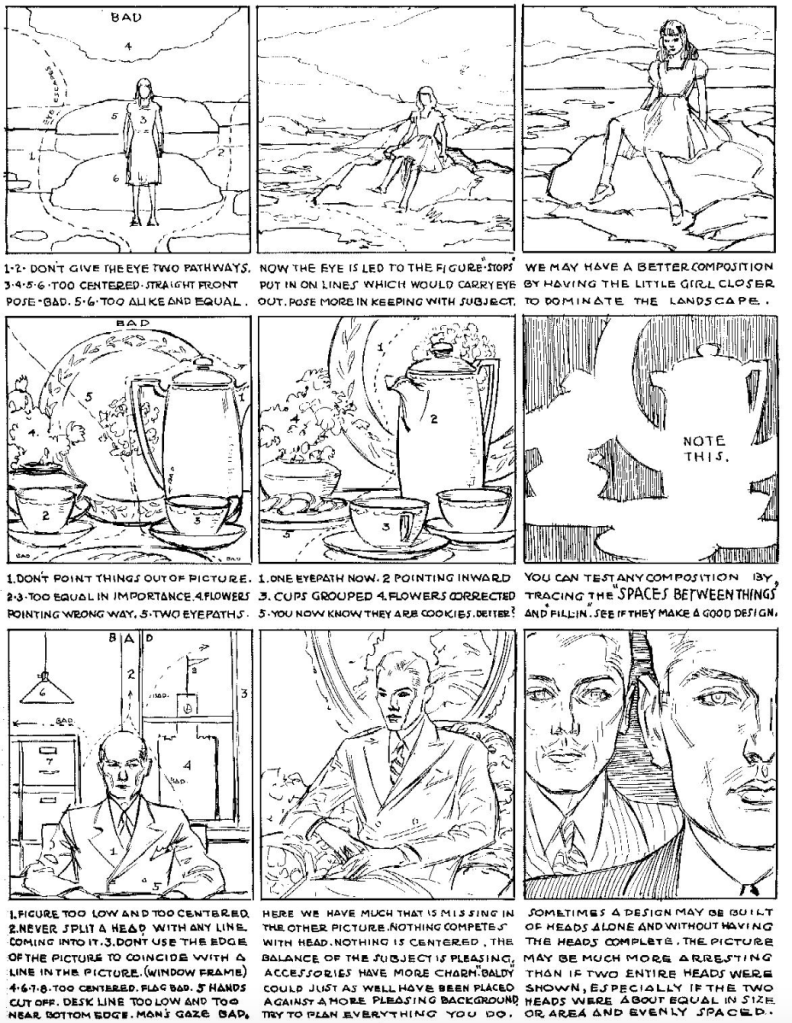
What “a bad composition” is, can be debated of course, but it can argued that the “a good composition” is the one you think subjectively displays the right interpretation of the subject, that you want to express. Using the tools Loomis gives us here can be an helpful path towards it.
The benefit of being an artist is that, with enough understanding of your tools, you can change certain things in your subject to better fit your Focal Point or to invent more dynamic and attention-attracting compositions. For example, changing the shape of cloud to better lead the eye to the center of interest.
A list of things to consider when making a composition as the picture above shows is to…
- Avoid two pathways for the eye
- If you want an Informal composition, avoid using equal and centered poses or arrangement of objects. Use more dynamic and “unequal” poses
- Always have a Focal Point
- Don’t let your arrangement go out of the picture. Plan your picture.
- Decide the objects of more importance.
- Use Clustering to better your composition
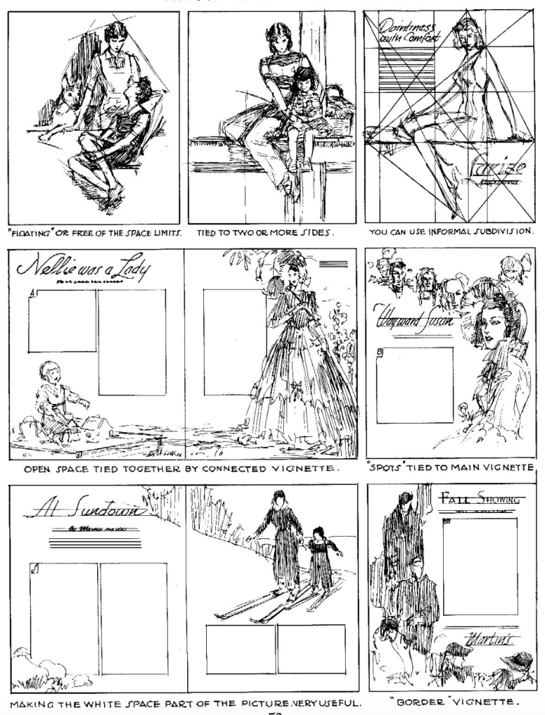

Loomis gives us here a list of the various types of vignette, which is an illustration, painting or drawing that’s made to fit the color or size of the paper. It’s commonly used in Comic Books, Book Covers, Advertising and so on.
It’s vignettes we end with, and it’s the Rendering Lines we’ll see in the next Section. If there’s anything you spotted to be wrong or anything that’s worth adding to the post, gladly give a comment below. Your thought and words are valued deeply here on JUFSEN!
As always, thank you for reading!

Leave a comment