
Today on the JUFSEN BOOK CLUB, we’ll start a new series, based on …
Creative Illustration by Andrew Loomis, released 1947 by its publisher Titan Books, which is a phenomenal book for any artist wanting to make headway for understanding all the nooks and crannies within the craft of not just illustration, but in general, the arts as a whole.
All credit goes to the rightful owner and author of the book, Andrew Loomis and its publisher Titan Books. This is a summation and interpretation in own words.
Part One of the book which discusses the concept of Line, has been divided into FOUR SECTIONS just to make it a little simpler for you!
Section 1 ✿ Seven Primary Functions of Line – p.25
꧁ Section 2 ✿ Line and Symbols – p.25 to p.33 ꧂
Section 3 ✿ Division and Perspective – p.34 to p.43
Section 4 ✿ Catching Attention – p.44 to p.53
Section 5 ✿ Rendering Line – p.54 to p.79
In the previous section, S1, we laid out the SEVEN PRIMARY FUNCTIONS of LINE, which if you briefly summarise it, discussed all the sorts of things line can do and express for as the artist. Andrew Loomis gives us a perfect quote for you to take with you, that pretty much sums it up.
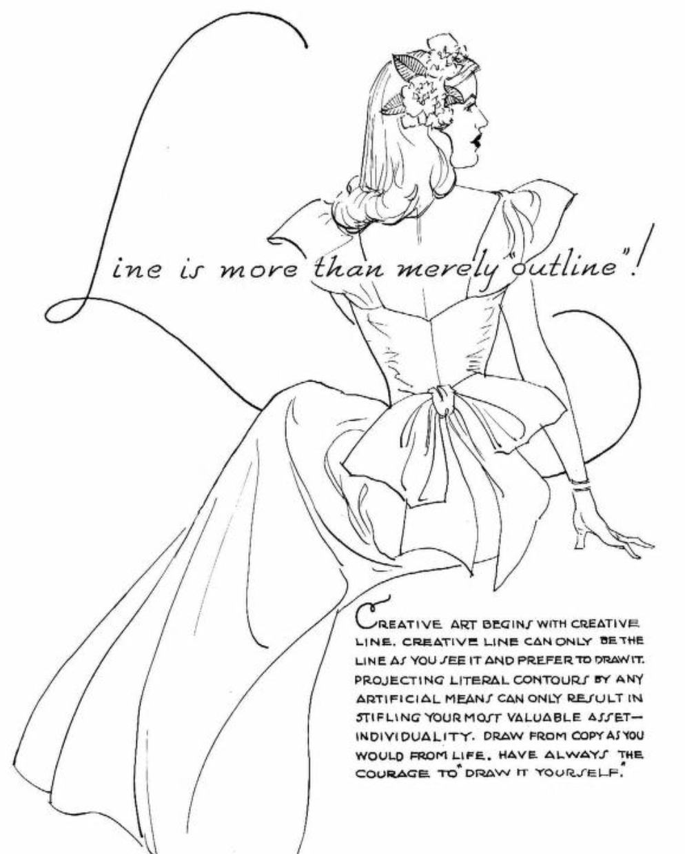
“Line is more than merely outline!”
Now to start off, we can take a look at another quote or axiom that’s worth taking in, that is… “CREATIVE ART BEGINS WITH CREATIVE LINE”
Now Creative Art is a whole other subject that you can discuss, but what we do know, and see in this book is that Creative Line is the right step towards it. In this book, a line that is said to be creative is said to be the one you see fit and prefer to draw. In this way, you don’t merely trace the subject of what you see, but you, more importantly, as said in in the introduction, interpret all that you see.
A good example could be drawing a rock.
Everybody will have their own interpretation of what they believe a rock is, that is what makes it so fun and special, the difference however, when it comes to the artist, the one who knows their tools, is that they can use them to actually express that interpretation in a for everybody to see. But a good course of action could be to express the sharpness or hardness of a rock, in this case, by simply using hard and sharp lines. In this way, you don’t just copy nature.
An advice that Loomis gives for those, that are to make a copy however, of an Old Master for example or any piece of art for that matter, is to of course, follow the general proportions of the drawing and to try to see how the Master solved the matter of drawing their subject. But what is equally important or more greater which Loomis believes, is that you don’t merely copy, but have the courage to give your own little BANG to the copy, in a way, you “draw it yourself”
Now let’s take a look and see all the sorts of tools the artist has to play with.

Here are some examples from the previous books of Loomis that line can offer in drawing, painting or illustrating. It’s the good old “Divided Ball and Plane Method“, and “Visual Survey Plan”.
Below is what Andrew Loomis calls, Formal Design of line. It’s when you typically use straight lines to divide your canvas or paper into equal parts, that often create a look of mechanics and order which may look unnatural to some. “Informal Design” is when the space is more unequally divided, and it’s where you use more fluid and free lines, while it is subjective, this often results in a more organic and natural appearance of your design.
Formal Design


Informal Design


Next, simple line can be used in creating composition or any sort of picture for that matter. Everything is form and every form has contour and planes, but most importantly, every form follows a sort of hidden rhythm. That’s up to the artist to discover. And a good way of finding it, could be to either cut a desired rectangular hole through cardboard, for example, or just use both of your thumbs and index fingers to create a little frame to see through.
All that you see within that frame, is for you as the artist to arrange and interpret. Any frame that you find will do, for it is as Loomis says… “(…) design and arrangement that makes the picture, regardless of subject”.
Divide all that you see within your frame with flowing or straight lines. Try to, as said, find the almost invisible rhythm that’s in your composition.
A way to go about it could be to…
- Cut a rectangular hole that’s somewhere around 10 by 7.5 centimeters or 4 by 3 inches, or just choose your own size.
- Walk around in nature, at home, in the city or whatever place available and look until you see, what you believe to be, a worthy composition.
- Hold out the homemade frame, close or far out from your eye, until you find the proper size.
- Now hold it in that position and make little miniature composition, where you look for all the sorts of lines and divisions you can find.
- Find some more compositions or render the one you’re on, if you wish. Have lots of fun!


This way of going about it, can be used both in interpreting your subject but also in creating your very own imaginative composition. And if you thought line was all you could use then oh boy, you’re not just limited to line! You can also use all sorts of things, such as letters, symbols, shapes, forms and so on. It’s up to you to decide, and interpret!


Well that was all for this section! There’s plenty more where that came from, but this was the general idea. If there’s anything you think is worth adding, worth saying and worth sharing then gladly give a comment below. Your thoughts and words and valued deeply here on JUFSEN!
As always, thank you for reading!

Leave a comment